Tuesday, July 19, 2011
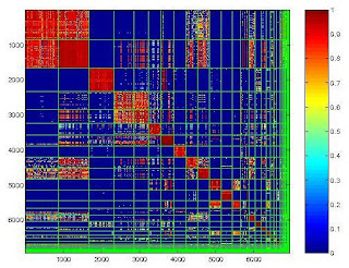
Similarity matrix
Stem and leaf plot
This is an example of what one would look like.
box plots
http://www.mathworks.com/help/toolbox/stats/boxplot.html
a box plot is a way of graphically depicting groups of numerical data through their five-number summaries: sample minimum, lower quartile (Q1), median (Q2), upper quartile (Q3) and the sample maximum. this box plot shows car mileage in different countries.
a box plot is a way of graphically depicting groups of numerical data through their five-number summaries: sample minimum, lower quartile (Q1), median (Q2), upper quartile (Q3) and the sample maximum. this box plot shows car mileage in different countries.
Histogram
a histogram is a graphical representation, showing a visual impression of the distribution of data. It shows an estimate of the probability distribution of a continuous variable. This shows US immigration from northern European countries.
Population profile
http://www.bibliotecapleyades.net/sociopolitica/esp_sociopol_depopu14b.htm
Apopulation profile is a chart showing the number of people as a function of their ages. this chart shows the population profile of less developed countries in the year 2000
Apopulation profile is a chart showing the number of people as a function of their ages. this chart shows the population profile of less developed countries in the year 2000
Index value plot
An index value plot is a way to show the relativity of all values to an indexed value. Here this graph displays trends in the FTSE stock-market index.
Lorenz Curve
The Lorenz curve is a graphical representation of the proportionality of a distribution. This graph is just an example of what consists of a Lorenz curve.
Subscribe to:
Posts (Atom)


