A transit map is a topological map used to illustrate the routes and stations within a public transport system. This is a transit map of the subway lines in Washington DC.
The Dymaxion map also known as the Fuller map is a projection of a world map onto the surface of a polyhedron, which can be unfolded and flattened to two dimensions. It depicts the earth's continents as "one island." The way its arranged disrupts the map only in order to preserve shapes and sizes.
A floor plan is an aerial view of each level of a building. It usually shows what each room on each floor of a building looks like and the square footage. this one is a floor plan of a condo.
A dasymetric map is a type of thematic map, that uses areal symbols to spatially classify volumetric data. this one shows climate and plant hardiness zones in north america.
A range graded proportional circle map is a proportional circle map that shows the circles in relation to ranges of data. this one shows course offerings in cartography at different universities and colleges in different states .
http://blogs.fxstreet.com/fxbootcamp/2009/11/ "The correlation matrix of n random variables X1, ..., Xn is the n × n matrix whose i,j entry is corr(Xi, Xj)." This correlation matrix is on the currency of different countries.
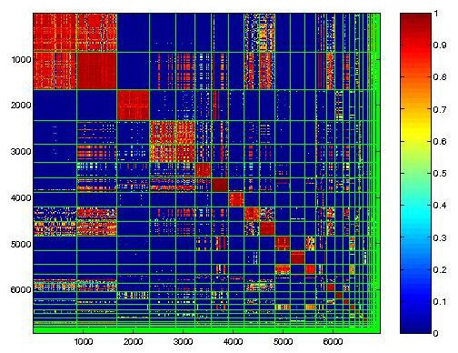
A similarity matrix is a matrix of scores which show the similarity between two data points. "This graph shows the similarities in between 32 profiles of the Malware infection.
"A stem and leaf plot is where each data value is split into a "leaf" (usually the last digit) and a "stem" (the other digits). The "stem" values are listed down, and the "leaf" values go right (or left) from the stem values."
a box plot is a way of graphically depicting groups of numerical data through their five-number summaries: sample minimum, lower quartile (Q1), median (Q2), upper quartile (Q3) and the sample maximum. this box plot shows car mileage in different countries.
a histogram is a graphical representation, showing a visual impression of the distribution of data. It shows an estimate of the probability distribution of a continuous variable. This shows US immigration from northern European countries.
Apopulation profile is a chart showing the number of people as a function of their ages. this chart shows the population profile of less developed countries in the year 2000
The Lorenz curve is a graphical representation of the proportionality of a distribution. This graph is just an example of what consists of a Lorenz curve.
A bilateral graph displays increases on one side of a zero line and a decreases on the other side. Bilateral graphs are used to show both the positive and negative values of data. This map displays selected countries’ bilateral trade balance with China by % of each country’s GDP.
Standardized choropleth maps allow comparison of distribution among different areas. This map displays mortality ratio data by county of high risk clusters of cervical cancer.
A univariate choropleth map is a choropleth map that shows only data for one variable. This map shows the discovery of Disease spatial pattern in the US.
An unclassed choropleth map numbers of categories is equal to the number of data values. The unclassed choropleth map is on the right side of this picture.
These maps show statistics for a given area by using different shading. This map shows the deaths in Australia during 1997-2000 from all causes under the age of 1 year.